 In this wonderful era of exciting, off-the-shelf prospect research tools and one-click-away data analysis, how is it that we still struggle to prioritize our donors and prospects? But we do. The results come in, the scores are assigned and yet there are still way more highly-rated prospects than our staff could possibly contact. Which names do we call on first?
Human brains are not wired to interpret and act upon long lists of names with appended information, such as those found in our databases and Excel spreadsheets. And when you need 50 names, but there are 300 that all have the same top score, it can be paralyzing!
Whenever I hear about data visualizations I always see pictures of charts and graphs in my mind’s eye. But when I was grappling with how to deliver a prioritized prospect list to a client recently I decided against charts and graphs. I wanted something that would give them a colorful visual with graphics, but also actual donor prospect names with dollar signs.
The organization had decided to create a more formal corporate giving program. It had been happening accidentally and now they wanted to get serious. So she sent me a list of over a thousand of their best donors based on giving history. My job was to sort it out and send it back.
We decided to focus on two variables that we labeled engagement and gift potential. Engagement was based on RFM scoring, which stands for recency, frequency, and monetary and represents a giving history analysis. We also appended some estimated sales and other data to determine gift potential.
As you can see from the picture below, the key to the data visualization was limiting the presentation two only two, easily understood and highly relevant variables. (The information in the grid is fictional.)
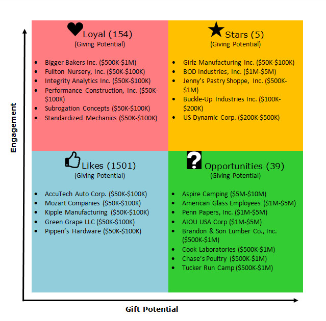
Following is how you “read” the picture for this donor list:
- Stars = high engagement, high gift potential
- Loyal = high engagement, low gift potential
- Opportunities = low engagement, high gift potential
- Likes = low engagement, low gift potential
I knew that my client, a talented fundraising professional, really wanted to begin her efforts with a fighting chance of receiving major gifts in the first year. Who wouldn’t want that? It was up to me as a researcher to understand how to translate the organization’s fundraising program intentions into data points, create or get those data points, and then translate it back into fundraising actions.
My client didn’t need to understand exactly how I sorted and filtered to assign donor prospects into each of these categories. She needed to be able to recognize some names, be pleased and surprised to see some names she didn’t recognize, and be able to quickly make decisions about which ones she will call tomorrow.
No matter what kind of fundraising professional you are – front-line, prospect research, or something in between – you now have a simple way to visualize two variables that you can ask for or apply to the data yourself.
If you have a data visualization triumph I’d love to hear about it! Reply to this email or better yet, comment on the blog post.
More Resources
- Data Driven Fundraiser’s Reference Guide
- 2017 Major Gifts Fundraising Benchmark Study (Including: Prospect Identification Methods Most Closely Associated with Meeting Goals)
- Prospect Research Institute’s Fundraising Analytics Link Collection
- Score! Takes the Edge Off Analytics